My favorite photo was the one of the girl pouring something into the spurting, pink liquid.
1. I chose this photo because I thought it was really well exposed, and it caught my eye.
2. I recognized The Rule of Thirds in the photo. I saw that using that rule of photography, it made the photo look more dynamic and visibly pleasing.
academic shoot
1. I think a great place to shoot photo like the ones I saw today would be a science class room or a fine arts room.
2. I would probably go to my spanish class and my jazz band class.
3. To get amazing photos I will use the rules of photography, and I will time things correctly.
Friday, September 25, 2015
filling the frame
This photo is almost completely filling the frame with intriguing things. There is an ominous sort of light source coming from the bottom center, and as the eye travels up, there are two people wearing unusual headgear, poking a stick at whatever the light is. I think this is very interesting because I do not know what they are doing. I want to learn more about what is going on, and it's a great picture for that reason and another; the photo fills the whole frame.
action and emotion
This photo is displaying action and emotion very clearly. There is water flying up into the air, the girls' faces are very vibrant with feelings of laughter and joy as well as awe and curiosity.
the story
This photo looks like the man in the photo is telling a story. When I look at it, I think to myself, what is he saying? Why is his body language like it is. He also looks very excited to speak.
Wednesday, September 23, 2015
least unethical photo
In my opinion, this is the least unethical photo. The only thing that was altered was the woman's teeth. No harm done. They even made her look pretty. How nice.
most unethical photo
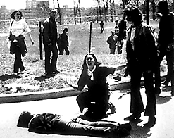
I think this is the most unethical photo. Only because the alteration is essential abusing the death of someone and the emotion of standbys to make the photo look a bit more dramatic. Maybe for profit or an award.
photo manipulation and ethics
Of the portion of the article I read, I think the message there was that people are altering photos in effort to point the favor in their biased direction. There were examples of completely removing people from photos, making themselves look more successful, and blatantly being careless with photo manipulation. I think this kind of photo manipulation is completely unacceptable, it goes against all of my personal morals. The dishonestly is the worst part in my opinion. The sacredness of capturing events through a photograph should never be tainted.
Monday, September 21, 2015
great black and white photographers part II
John Gutmann
John Gutmann was born on the 28th of May in 1905, and he passed in 1998 on the 12th of June. He was German born, and after escaping Nazi Germany for his investment in Judaism, he fled to America and started his art and photography career. John Gutmann got his education at the Prussian Academy of Arts. John Gutmann worked as a painter as well as a photographer.
Thursday, September 17, 2015
post shoot reflection
1. When I was trying to find adequate photos for the four prompts (as well as a merger), I found that I had trouble coming up with ideas for "square." I had immediately known what I was going to do for the "metal" photo. I just could not find any squares.
2. I believe that I have always been relatively good about having a camera in my hands, focusing, and using a camera. I come from a long line of photographers. The one thing I struggle with a lot of the time is framing the subject in the photo. Making the subject fit into the photo is not always my best work. It is not that I can't ever get it, I do eventually, it just takes a little bit extra from me.
3. I think if I could do the assignment again, I would change the way I did my "square" photo. I would have taken my photo of a natural geometric shape instead of one that was already made for me.
4. I would keep my "metal" photo the same. I think I did a great job of displaying lines in that photo.
5. (done)
6. I am very interested in doing the same photos again because I do not think I did a very good job with the photos I took before.
_________________________________________________________________________________
http://norasphotojournalismblog.blogspot.com
I really liked Nora's use of geometric shapes in her photos. I think it made them look very clean and cut.
I also liked her square photo and the use of simplicity. It's not a great example of simplicity, but a little goes a long way. It really made the subject obvious to me.
One thing I think she could improve on was her "Bowie" photo. I don't really understand what the subject of the photo was. It was also a little blurry.
prompt shoot photos
Metal
In this photo, I achieved "lines" by getting underneath the chair.
Bowie
In this photo, I achieved "lines" and "framing" by putting my subject in the very center of the photo, framing her with the poles.
Happy
In this photo I used the rule of thirds to make my lovely subject, Bella, be a little more obvious as the subject.
Square
I this photo I think I had a little bit of simplicity to accentuate the square and the diagonal lines in the photo.
Merger Photo
Friday, September 11, 2015
avoiding mergers
This photo is a good example of a merger because it is very unclear. Some parts of the people are blending in with the wreckage, there are men whose limbs and bodies have been cropped out of the photo, the subject is very unclear due to the surrounding objects.
framing
I think this is a great framing photo because the frame element is very dynamic. The diagonal line of the foliage frame, and at the same time, flow right into the subject. The buildings on the side and bottom also clearly display the falling World Trade Center as the subject.
balance
I think this is a really good example of balance. I think that the two towers with smoke coming off of them gives a great left-to-right sense of balance, and then the people walking at the bottom and the perspective that the photo was taken from, add a clean touch of balance.
lines
I think this is a great photo to display lines, the photo has vertical lines as well as diagonal ones that use many different shades and shadows. I think that this is a good photo because the affect of lines makes it obvious that the man is the subject.
the rule of thirds
This is a good example of rule of thirds because it has the subject in the bottom left section of the photo. The photo also clearly shows the entirety of the more frontward building, rather than the falling tower in the background, giving the photo a more dramatic affect.
simplicity
I think this is a great example of simplicity because the subject is clearly displayed. The background is diluted and plain enough that the viewer can tell the man is the subject.
Friday, September 4, 2015
the camera
1. The Camera Obscura Effect was the first way of capturing an image. By focusing light through a small hole, a projection was put, upside-down, on the wall outside the hole.
2. The glass lens was invented, by Isaac Newton and Christian Huygens, in the 17th century and was a large step closer to modern cameras.
3. The part of the first modern camera, invented by Niepce, was film. It was made so that the photographs could be physically captured.
4. Niepce's camera and the modern camera still function in very similar ways. The light travels into the lens, through the camera, and exposes the film.
5. Digital cameras use electronic sensors that create digital film.
6. The difference between Auto and Program mode is that the photographer has more control over flash and other settings when using Program mode. Unlike Auto mode, that gives the photographer no control over flash or exposure, it takes care of those things on its own.
7. Portrait mode is used for taking photos of objects without any other distractions. Portrait mode blurs out the background and focuses on the subject.
8. Sports mode is used to take action-shots. It uses a very fast shutter speed, meaning it stops motion in a way. The shutter speed determines how long the camera will let light into it. If the shutter speed is slow (long), it will capture a lot more movement. Rather than a fast (short) shutter speed, which will capture very little movement.
9. A half press has many positive outcomes for the photographer. Such as, quicker reaction time from the camera, the camera locks focus on the subject, and better more accurate composition.
10. This symbol means, disabled or no flash. Many photos were not taken with flash because sometimes they are better when they utilize the natural light.
11. This symbol means, auto-flash. The camera will automatically use the flash when it senses that more light is needed in the photo.
12. If the picture is overexposed (has too much light), the photo is washed out and nothing is seen but white.
13. If the photo is underexposed (not enough light), then the photo will be too dark to make out.
14. A "stop" is a relative change in the brightness of light.
15. If there were two suns instead of one, the planet would be +1 stop brighter.
16. If there were four suns instead of two, the planet would be +2 stops brighter.
17. The effect of a longer shutter speed is that the camera lets in a lot more light.
18. The effect of a short shutter speed is that the camera lets in less light than a longer shutter speed would.
19. The aperture controls how much light is let through.
20. To increase the amount of light when using the aperture, you can make smaller F-stops, creating larger openings, increasing the light let in.
great black and white photographers
William Klein
Candy Store, Amsterdam Avenue
John Guttman
Strange Visitors
Paul Outerbridge
Triumph of the Egg
Wednesday, September 2, 2015
photo of a living thing
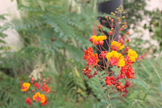
I like this photo a lot. I took a lot, of this particular plant, because I just thought it was fantastically beautiful. I took a few that I really did not like, but I chose this one because of the contrast between green leaves, warm colored flower, and the black pole in the background. That is also another thing I actually don't like about the photo. The only thing I don't like and think is bad about the photo is the background. I don't like the pole or the pavement in the background because I believe it takes away from the photo. I like how focused the flower is though.
my free choice photo
I really like this photo of a light. I chose this photo because I really loved it, I wanted my free choice to be my favorite photo. I like how well I focused in on every single piece of dust and grime in the plastic covering. I don't like how the entire light wasn't captured in the photo, I tried to get all of it, but the quality of the photo wasn't as good when I did that. I kind of liked that it wasn't all in the photo as well.
Subscribe to:
Comments (Atom)


